2 things this month:
First! I am going to be a grandma! Kyle and Beth are going to have a baby, so I am very busy making Baby Party Invitations.
Second. I need to make a bunch of birthday cards, and I don't have a lot of time, because I am making a bunch of Baby Party Invitations.
Solution:
I am going to make copies of some cards I made before, for my sister. I really liked them, they are my usual simply constructed cards, that use pretty color combinations. Do you keep copies or pics of your "old" cards or a do you keep sketches of lay-outs and projects you loved? If you do, when you're in a pinch, you can refer back to them, for quick ideas. No need to re-invent the wheel.
Every animal leaves traces of what it was; only man leaves traces of what he created. -Jacob Bronowski
Tuesday, August 16, 2011
JULY
I am a big fan of snow, rain, cold, chilly weather, sweaters, wool, boots - you get it. Summer is really hot. The one thing about summer in Maine, though, is everything is green. Garden flowers bloom, and the long sunny days make ice-cream a must. That is always good. Since, I have made a commitment to "turn over a new leaf," I am trying to appreciate glorious summer more, really enjoy these golden days. I can sit outside much later, without freezing. No shoveling. The cat gets to bask in the sun, and he does like that quite a bit. So, July -- do your worst -- I am ready for you!
June Anniversary Card, Make it Colorful! Make it Creative!
My daughters, Beth and Allison love to travel. They went on mission trips, as kids. Went away to school, when it came to college, and after Kyle and Beth got married, and Allison married Nic, both of my daughters continued traveling with their equally adventurous hubbies.
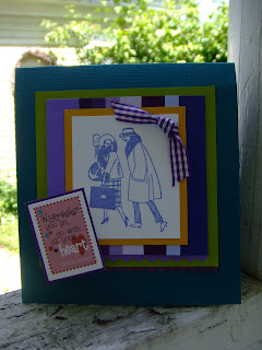
When it came time to make Nic and Allie's anniversary card, I searched my stash, and this stamp reminded me of them, and their journey through life. I really like the way it turned out.
What is nice about this little card is that you can use any stamp and whatever scraps of paper you have lying about. I happened to have used cardstock strips, but it would be a lot of fun with patterned papers, too. I cut strips of cardstock into various widths, to give the card more "movement" and compliment the theme of my card. Essentially, this is a very simple, triple matted card.
1. Create your card base. I selected a blue hue with a lot of green in it.
2. Make your first mat. I selected a yellowy-green. It offers contrast, but is still an analogous color with my dominant purples and blues.
3. Make your second mat from scrap strips. I keep my scrap cardstock separated by colors, so I just pulled out my bag of purple scraps, and I was good to go! You will note that I have papers of almost the exact same size at either side of the mat. That does tend to contain my image a bit. If you are more random, you'll have a more dynamic card.
4. The third mat is a deeper yellow. This darker shade pops my stamped image, and it refers back to my green mat. Both the green and yellow mats are warm, and showcase my two most important elements, the strips mat, and the stamped image (both composed of cool colors).
5. I stamped the image with a lilac ink that looks fresh, and yet has just enough of a vintage feel to work well with the 20's image of my stamp. It's kind of fun to have this old-timey image stamped on this bright, very new looking card front. I like to work against type, just for fun!
6. I trimmed my mats with a scrap of purple gingham ribbon, and scalloped edge trim, in two different shades of purple. I just used scalloped scissors in two different sizes.
7. A ready-made die-cut title block, adhered to yet another purple mat completes my card. Not only does this verse perfectly fit my theme, but, again the colors work well with my card.
8. The size of your card and mats will depend on what stamp you use. Trust your instincts. I am a pretty precise kind of person, but for me, creativity is about experimentation, self-expression and play. So, try what "feels right" and give it a whirl. Work with what you have on hand!
TIP: If you do want to create a cohesive, balanced feel, use patterned papers that all have one color running through them (for example, papers with yellow patterns), or opt for analogous colors of solid papers, like I have done here. The more contrast in your papers, the more lively your card will appear.
I'd love to see your versions of this idea!
Bazzill: Cardstock, Chip Toppers die-cut; Tin Can Mail: Stamp; Stazon: Ink; Provo Craft, The Creative Memories Collection: Decorative Scissors; May Arts: Ribbon; American Crafts: Adhesive
Subscribe to:
Comments (Atom)


